
A ubiquitous icon elevated by a clear typographic hierarchy and system with a simple guide: the symbol is the hero, the type contextualizes it.
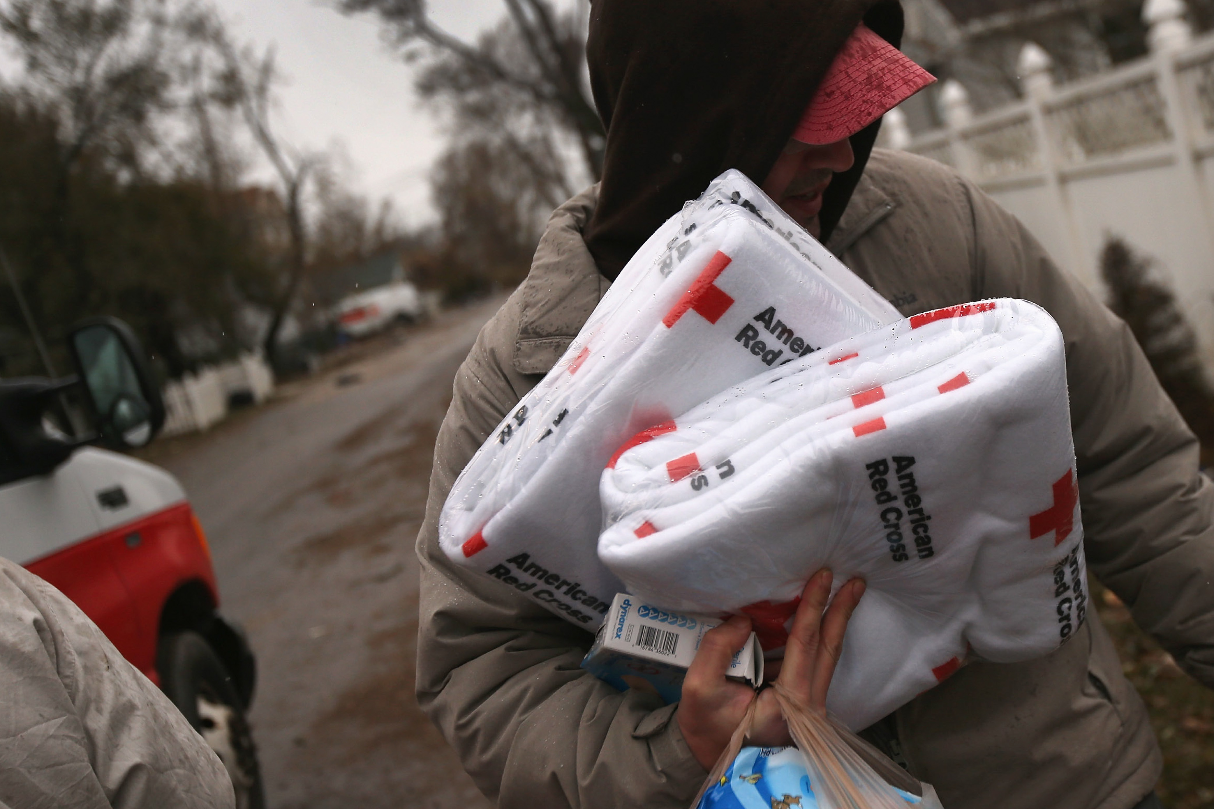
Designed by Wally in the mid-90s as a significant shift to their visual identity system, it continues to serve the American Red Cross 25 years later, giving agencies and creative teams a clean system for new messaging to serve those in need.
Designed by Wally in the mid-90s as a significant shift to their visual identity system, it continues to serve the American Red Cross 25 years later, giving agencies and creative teams a clean system for new messaging to serve those in need.


Above
Coming across an American Red Cross Donor Centor in Boston over twenty years later in 2019, Wally revisited the significance of this program:
Coming across an American Red Cross Donor Centor in Boston over twenty years later in 2019, Wally revisited the significance of this program:
“Last night I was in Boston and went for a walk after dinner. I came across an American Red Cross building that has the signage as specified by the program I developed with Margaret Youngblood leading me at Landor San Francisco in the mid-90s. The program we made for was really an exercise in simplifying and decluttering a system that had gotten complicated over the years. We reduced the amount of signatures from 18 to 3 (massive symbol, medium symbol, small symbol), changed the typography from multiple weights of Clarendon to Akzidenz Grotesk, and made the shift from “Disaster Services” to “Disaster Relief”.
Funny thing is, last week in Des Moines, I saw a truck with the large symbol, and large Disaster Relief - something I never saw implemented. Now here is this. Two examples, in two weeks, looking brand new, that seemed to have taken the lead from the small guideline we gave them over 20 years ago. And I thought it looked great.
It was also on this project that I had to fly to Washington DC to make a presentation in the original American Red Cross National Headquarters. Margaret ended up not being able to make the meeting so I had to go by myself. This was my first solo presentation. It was in this amazing room with massive original Tiffany stained-glass windows behind me. I thought I was presenting to 4 people. It ended up being 38. I sweated. I stammered. I tripped over my words. It was terrible. I learned a lot. And in the end, they loved everything and thanked me for all the hard work and thinking we brought to them.”
Designed by Wally with creative direction by Margaret Youngblood at Landor.
Visual identity system
Naming
Brand architecture signature system
Uniform design
Vehicle design
Brand guidelines
Naming
Brand architecture signature system
Uniform design
Vehicle design
Brand guidelines
Wally Krantz’s Outside Order is based in Brooklyn, New York.
OO&Friends
is a strategic design studio making creative thinking real.
© 2021-2025 Outside Order Inc. All trademarks are the property of their respective owners.
Header photography © 2025 Wally Krantz.
Neue Haas Grotesk typeface by Commercial Type.
Website designed on Cargo.
Neue Haas Grotesk typeface by Commercial Type.
Website designed on Cargo.