With nearly 300 locations and a $2.5 billion investment in upgrading properties, Comfort wanted to signal the updated and new guest experience with a refreshed logo and visual system that would serve as a beacon for the new Comfort Inn & Suites.
A new monogram C was designed as a sculptural form that emanates warmth from within.
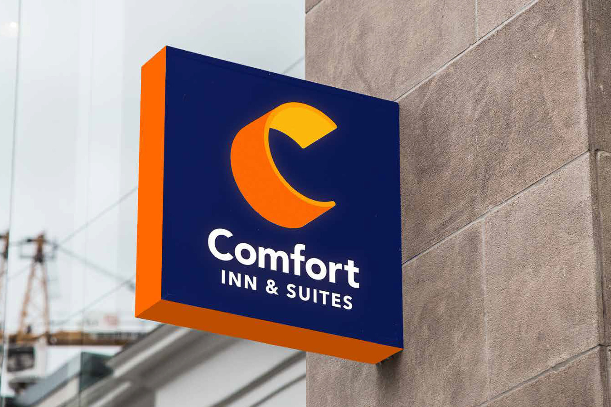
The monogram was translated from a sculptural object with a sense of space, volume, and warmth. Wally worked with sheets of copper to get the feel for a form that could be both enveloping and dynamic. The visual translation of that form into a symbol paired orange on the outside with a brighter yellow on the inside gave it a sense of warmth from within.
Both the identity and the signage program developed with David Rockwell used an evolved color palette of yellows and oranges on dark blue that serves as a literal beacon for travelers.
A new monogram C was designed as a sculptural form that emanates warmth from within.
The monogram was translated from a sculptural object with a sense of space, volume, and warmth. Wally worked with sheets of copper to get the feel for a form that could be both enveloping and dynamic. The visual translation of that form into a symbol paired orange on the outside with a brighter yellow on the inside gave it a sense of warmth from within.
Both the identity and the signage program developed with David Rockwell used an evolved color palette of yellows and oranges on dark blue that serves as a literal beacon for travelers.


Creative direction and design by Wally and Jane Boynton, and Xander Vinogradov with Sarah Schneider and Paul Verga at Landor.
Signage program developed with David Rockwell.
Visual identity system
Signing program
Guidelines
Signing program
Guidelines
Wally Krantz’s Outside Order is based in Brooklyn, New York.
OO&Friends
is a strategic design studio making creative thinking real.
© 2021-2025 Outside Order Inc. All trademarks are the property of their respective owners.
Header photography © 2025 Wally Krantz.
Neue Haas Grotesk typeface by Commercial Type.
Website designed on Cargo.
Neue Haas Grotesk typeface by Commercial Type.
Website designed on Cargo.