The sensibilities established in the iconic FedEx logo have served as a foundation for their evolving communication and brand architecture needs for over 25 years.
Wally was a key part of an excellent team brought together to create the logo and a connective visual system with an emphasis on simplicity and clarity.
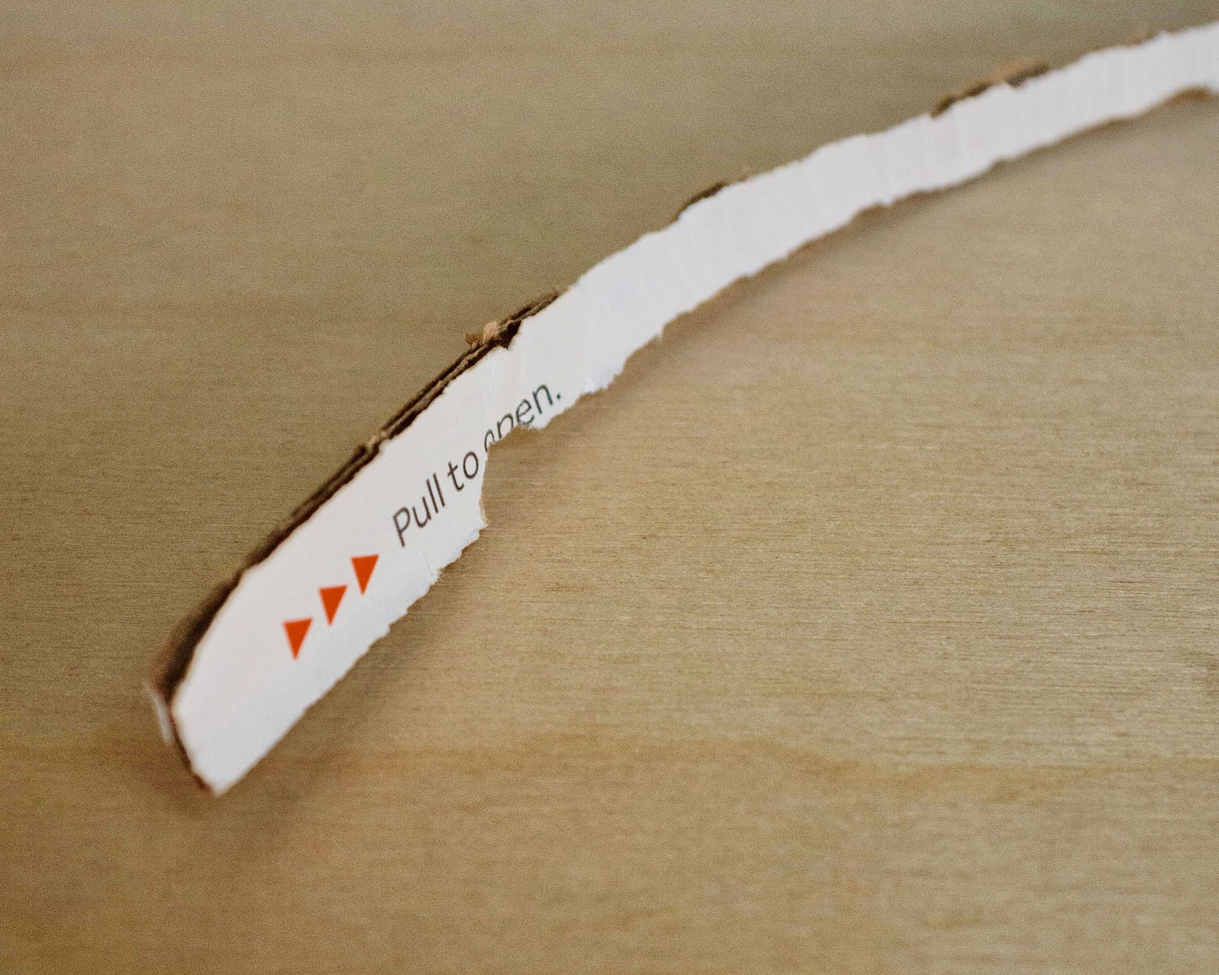
Refreshed colors and a new typographic approach connected every touchpoint including packaging and forms, ground and air fleet, uniforms, dropboxes, signage and environments, partnerships and sponsorships, and the beginnings of a digital presence.
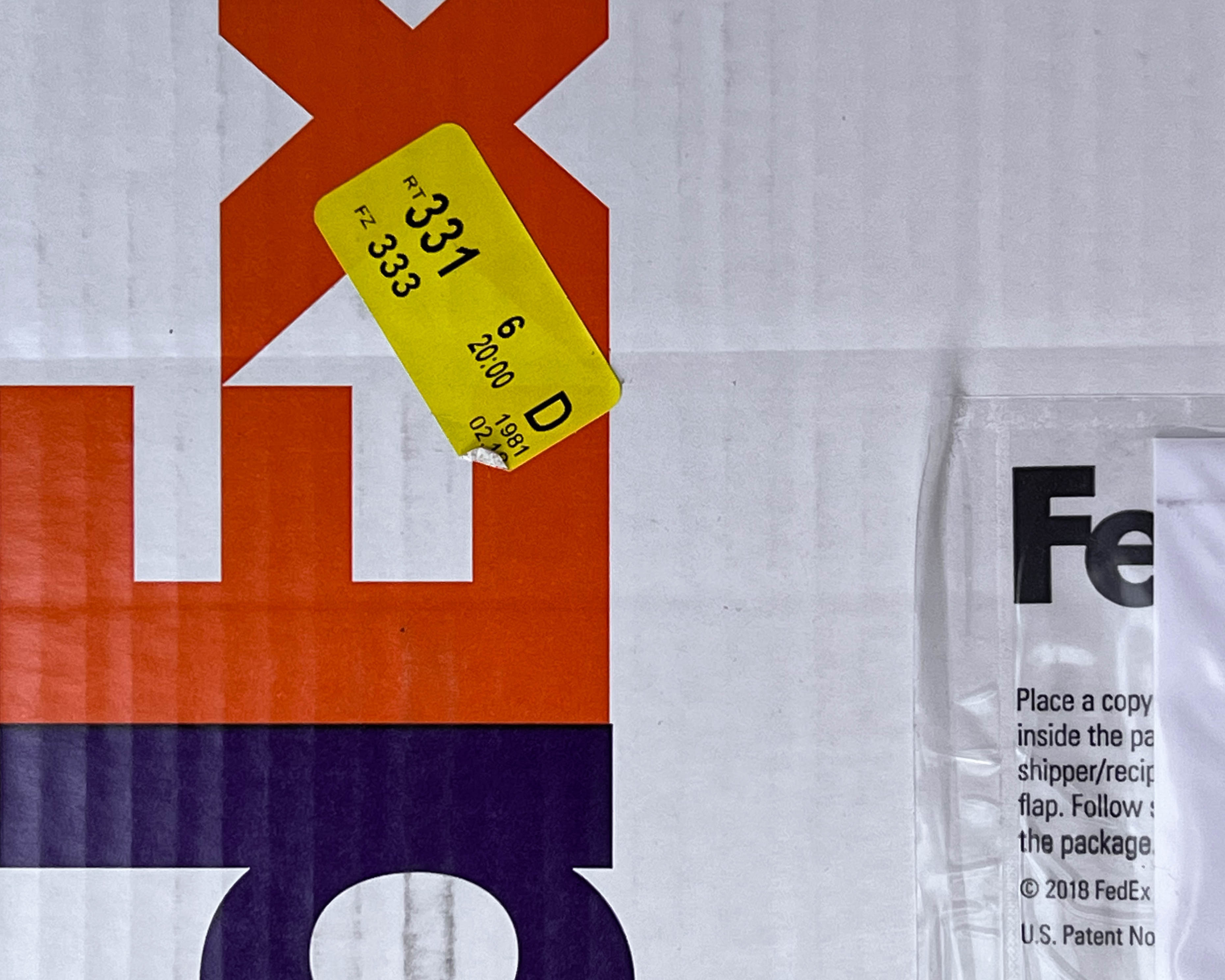
People still delight in the arrow.
Wally was a key part of an excellent team brought together to create the logo and a connective visual system with an emphasis on simplicity and clarity.
Refreshed colors and a new typographic approach connected every touchpoint including packaging and forms, ground and air fleet, uniforms, dropboxes, signage and environments, partnerships and sponsorships, and the beginnings of a digital presence.
People still delight in the arrow.


Above
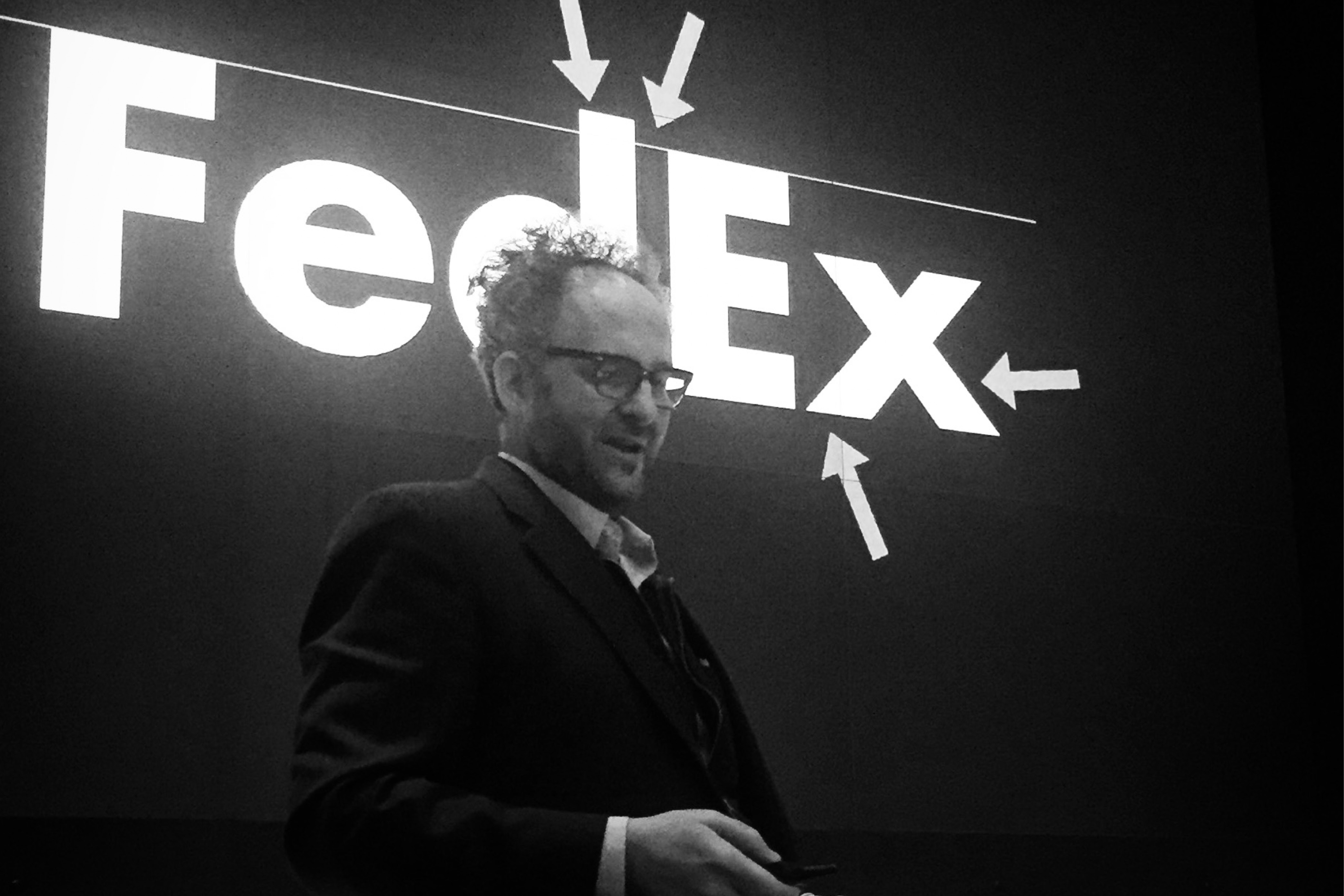
Wally in Memphis sharing the orgins of the design program with FedEx employees—over 20 years after the the logo launch.
Wally in Memphis sharing the orgins of the design program with FedEx employees—over 20 years after the the logo launch.
Below
Exerpt from Wally’s article in Print Magazine on the history of the the logo:
It’s as fresh today as it was when it we designed and launched it in 1994. The design system has grown, adapted, and flexed to serve FedEx’s evolving needs for over 25 years. The clean and uncluttered sensibility of the logo - with something special inside of it, the arrow in the negative space between the E and the x - has been able to carry the design DNA and inform FedEx communications across letters and packs, vehicles, uniforms, advertising, websites, and apps.
It’s the way people have embraced this logo, not as just a corporate mark, but as a piece of pop culture that has a ubiquitous affinity from anyone that has seen or been shown the “hidden” arrow.
Several times a year I’ll receive a text or email from a friend telling me a story about someone seeing the arrow for the first time. One was from a colleague sharing a text from her friend that teaches art to 4th grade students: “I showed one of my classes the FedEx logo today. I can’t express how fulfilling it is to watch their minds being blown. They’re so genuine. I may not teach them art, I may not influence them to be kinder or more helpful citizens, I may not affect their life in any meaningful way, shape or form, except that from now on they can never unsee that arrow.”
We found a way to engage both designers and non-designers and that’s why it’s stayed a part of the conversation.
![]()
Exerpt from Wally’s article in Print Magazine on the history of the the logo:
It’s as fresh today as it was when it we designed and launched it in 1994. The design system has grown, adapted, and flexed to serve FedEx’s evolving needs for over 25 years. The clean and uncluttered sensibility of the logo - with something special inside of it, the arrow in the negative space between the E and the x - has been able to carry the design DNA and inform FedEx communications across letters and packs, vehicles, uniforms, advertising, websites, and apps.
It’s the way people have embraced this logo, not as just a corporate mark, but as a piece of pop culture that has a ubiquitous affinity from anyone that has seen or been shown the “hidden” arrow.
Several times a year I’ll receive a text or email from a friend telling me a story about someone seeing the arrow for the first time. One was from a colleague sharing a text from her friend that teaches art to 4th grade students: “I showed one of my classes the FedEx logo today. I can’t express how fulfilling it is to watch their minds being blown. They’re so genuine. I may not teach them art, I may not influence them to be kinder or more helpful citizens, I may not affect their life in any meaningful way, shape or form, except that from now on they can never unsee that arrow.”
We found a way to engage both designers and non-designers and that’s why it’s stayed a part of the conversation.

Logo design and design system creative direction by Lindon Leader and Courtney Reeser, designed by Wally with John Lutz, Bill Chiaravalle, David Garcia, Rachel Wear, Jenny Bostic, and David Rockwell at Landor.
Evolved work creative direction and design by Wally with Jemma Campbell and Xander Vinogradov at Landor.
Brand refresh
Visual identity system
Fleet design
Package design
Form design
Signage system
Visual identity system
Fleet design
Package design
Form design
Signage system
Wally Krantz’s Outside Order is based in Brooklyn, New York.
OO&Friends
is a strategic design studio making creative thinking real.
© 2021-2025 Outside Order Inc. All trademarks are the property of their respective owners.
Header photography © 2025 Wally Krantz.
Neue Haas Grotesk typeface by Commercial Type.
Website designed on Cargo.
Neue Haas Grotesk typeface by Commercial Type.
Website designed on Cargo.