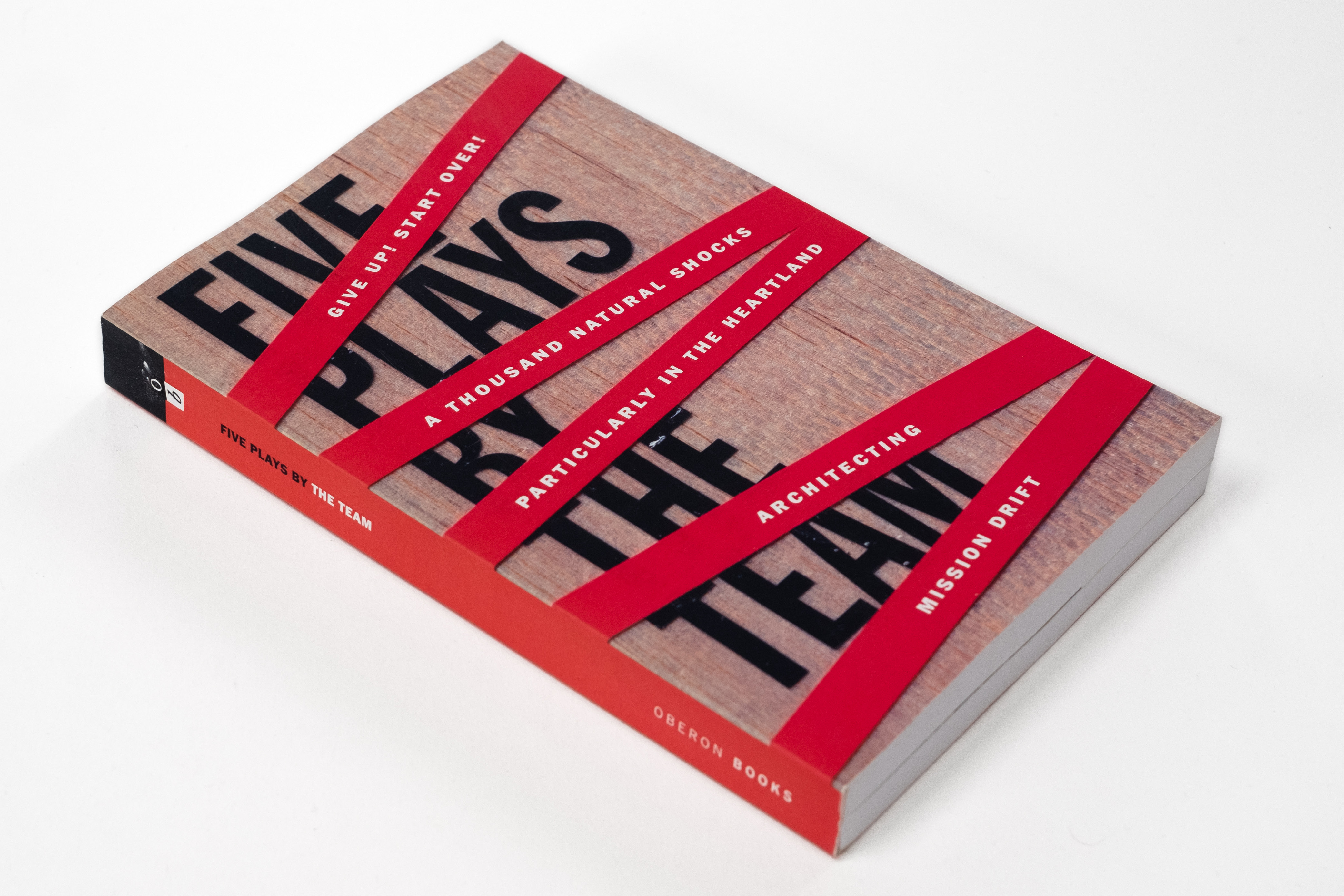
Tony Award-winning director Rachel Chavkin asked Wally to create a cover for a collection of the first five plays performed by The TEAM. Rachel wanted something that could capture the raw spirit, energy, and urgency that The TEAM’s plays have brought to audiences around the world.
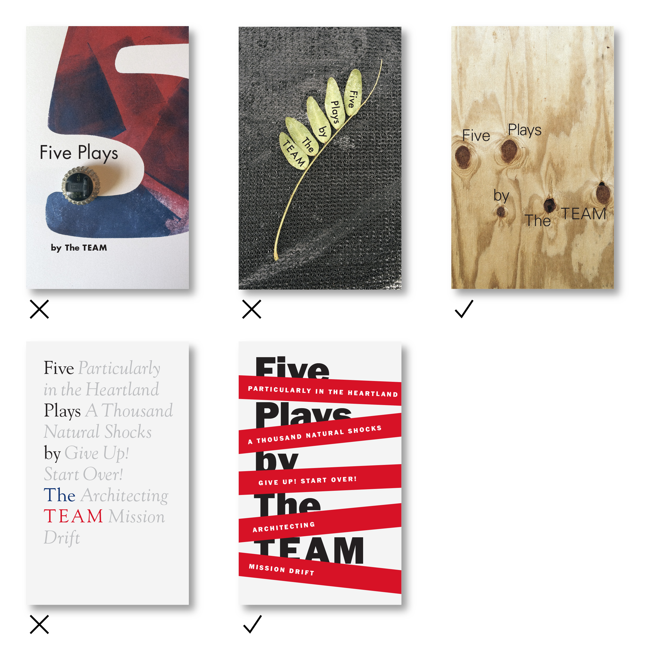
Several directions were shared with Rachel and The TEAM with concepts centered around a group of five (the number, objects) and raw materials for building and construction.
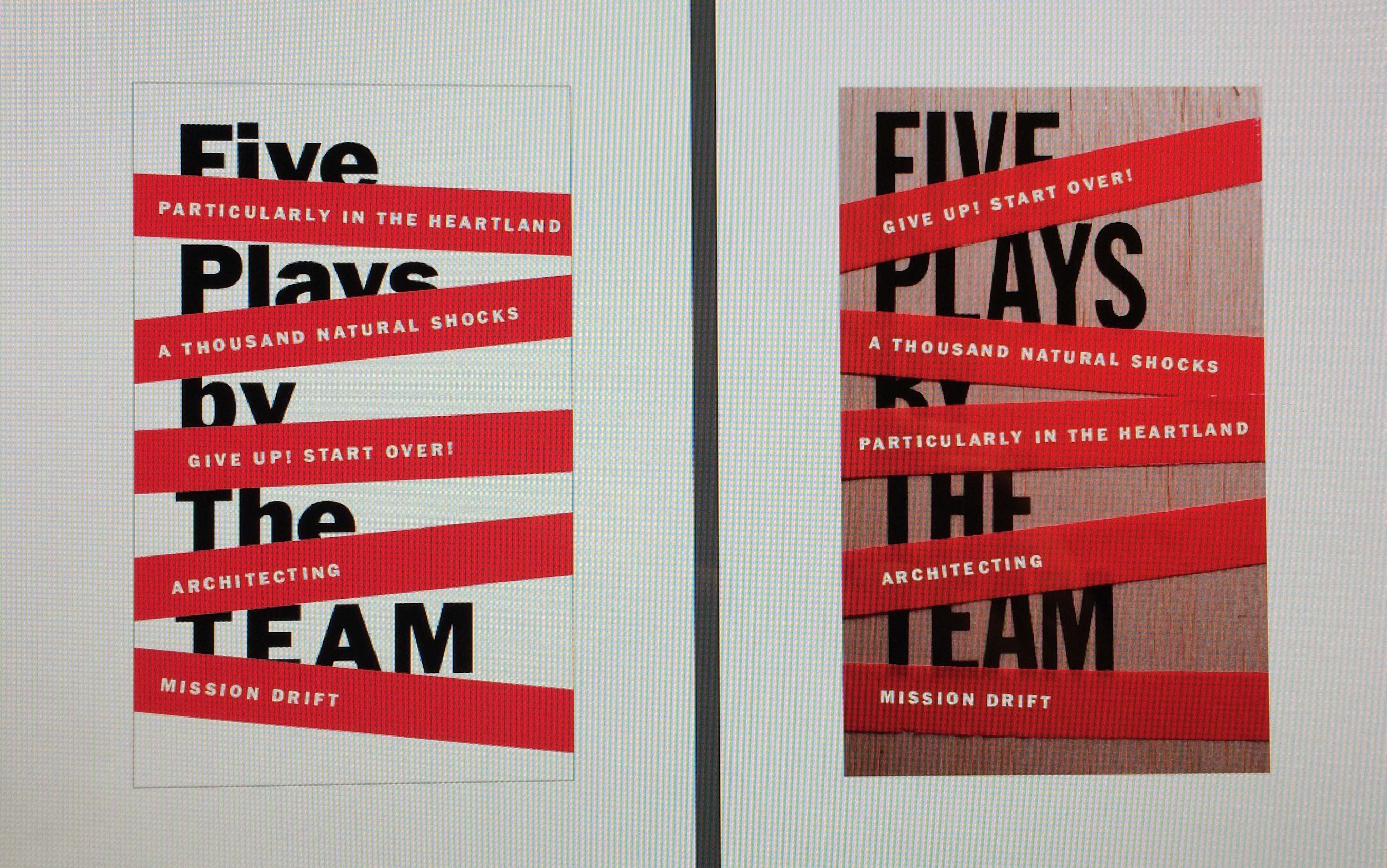
A typographic design that used red bands to slightly obfuscate the title of the collection while communicating the title of each play was selected. The only ask was that we bring in some of the raw material of the plywood from an alternate concept.
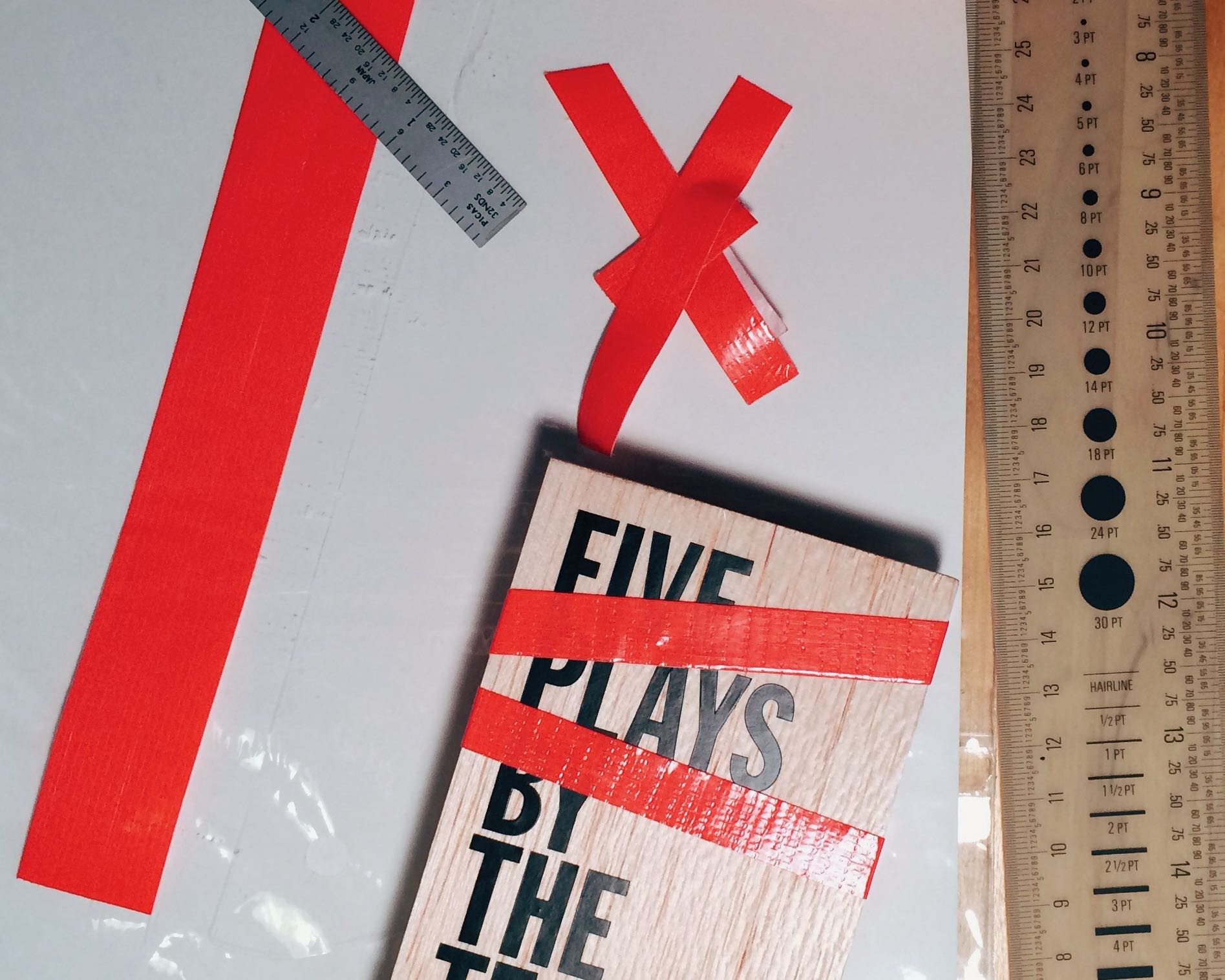
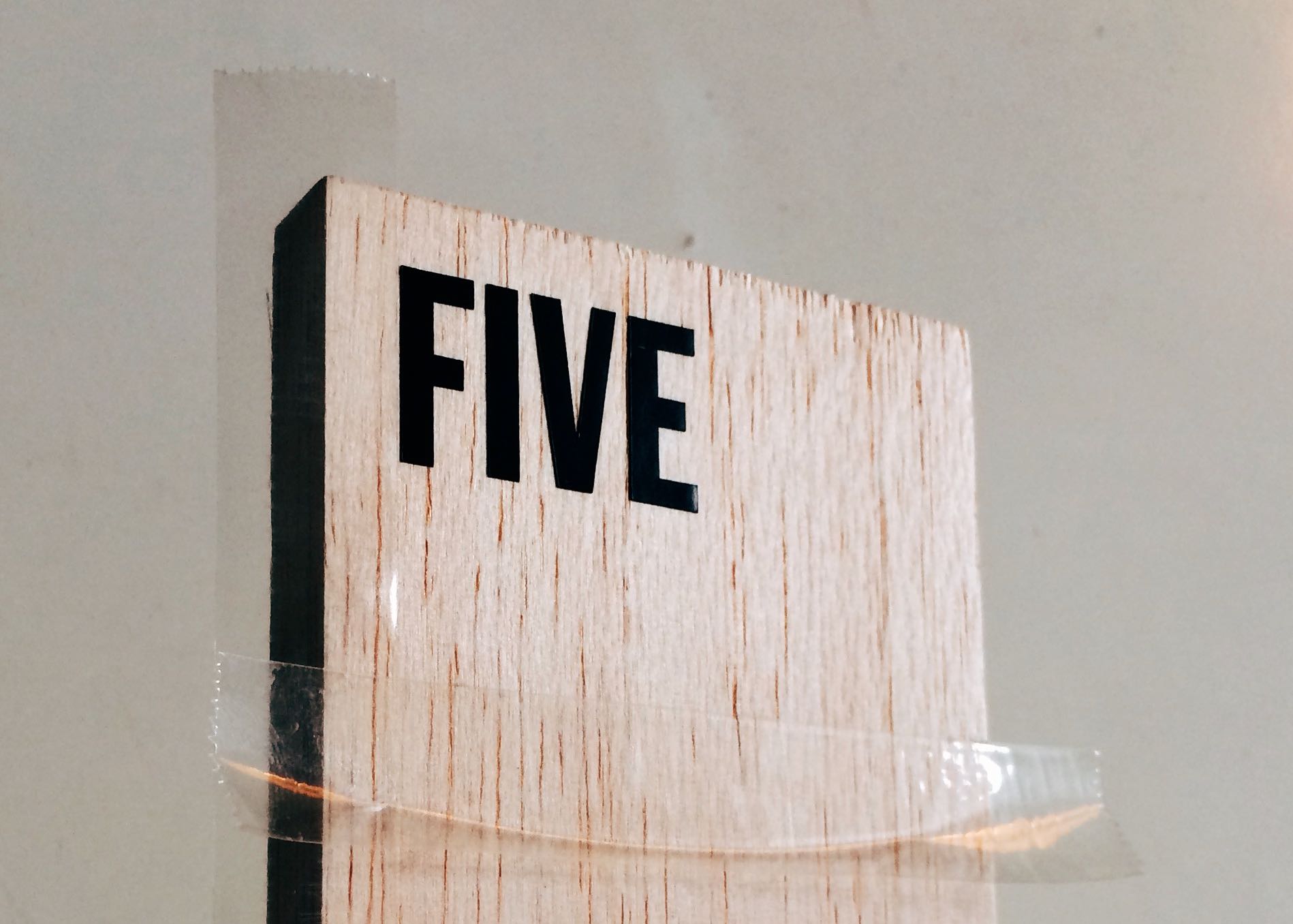
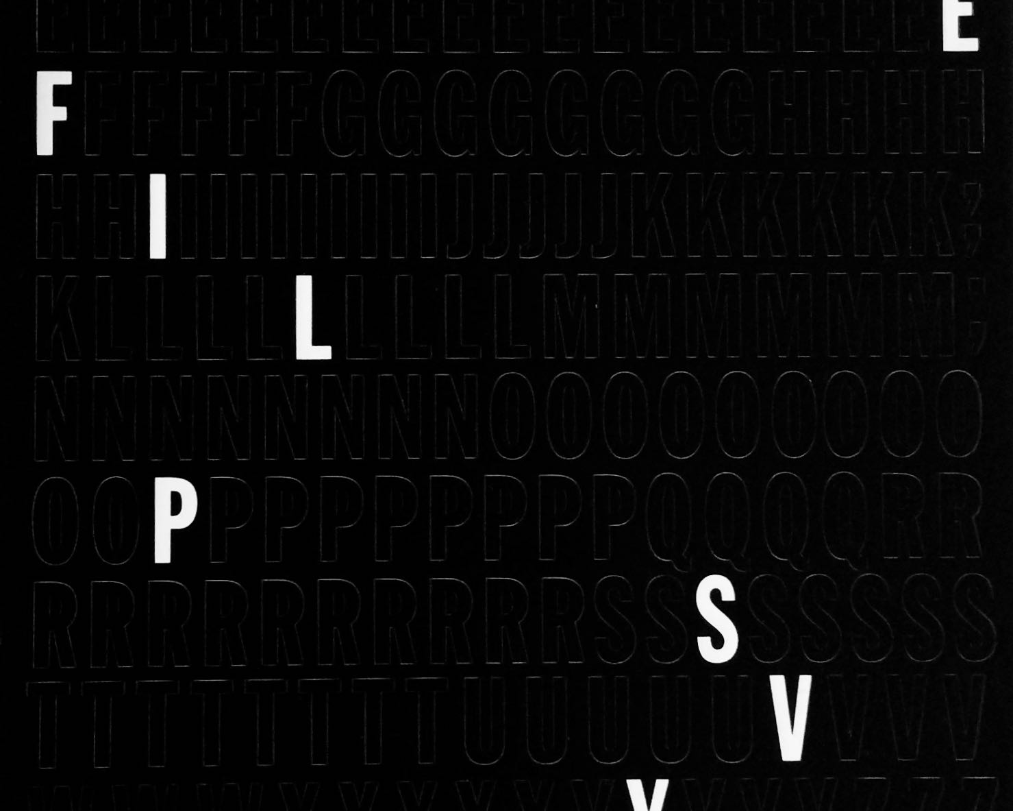
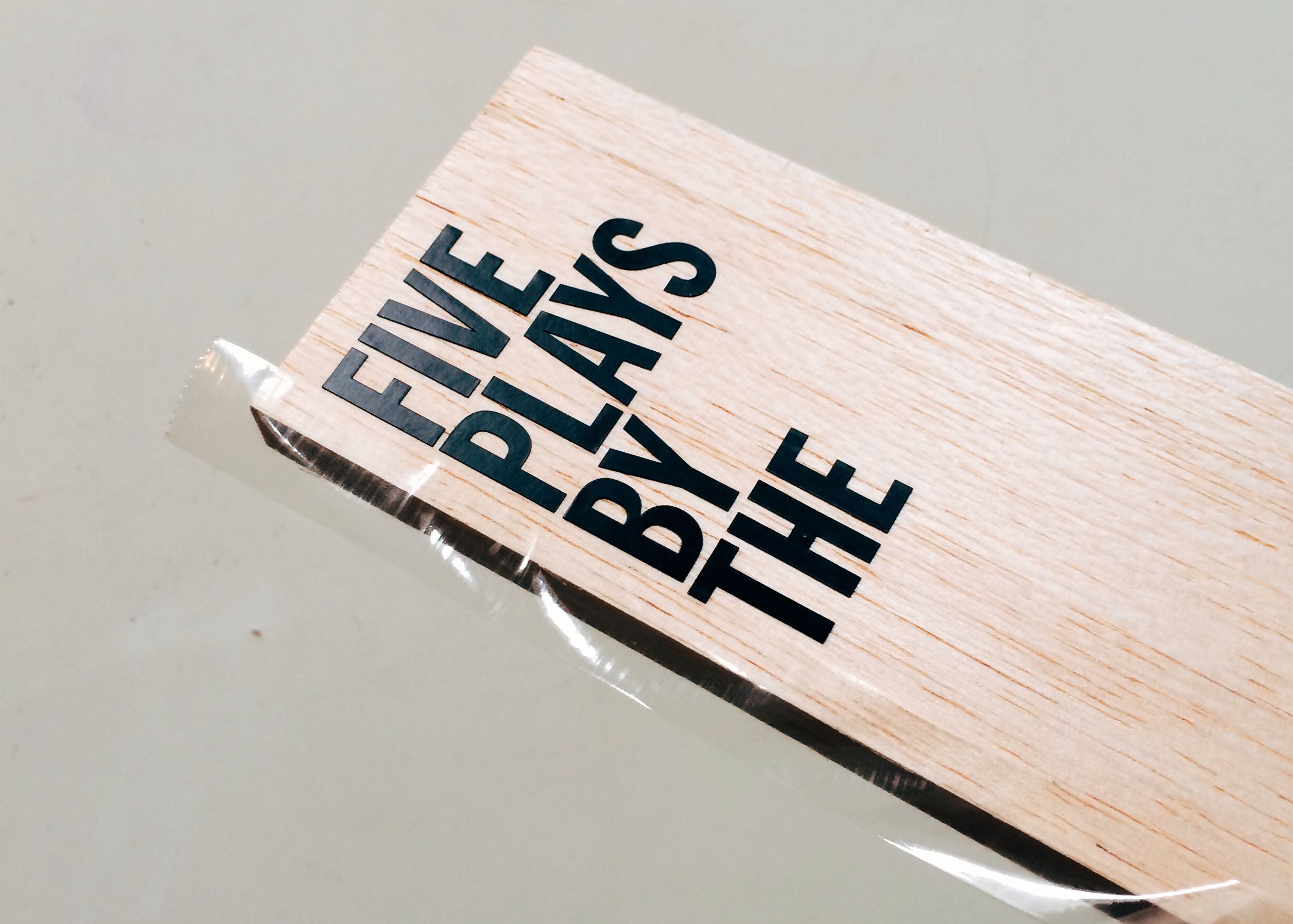
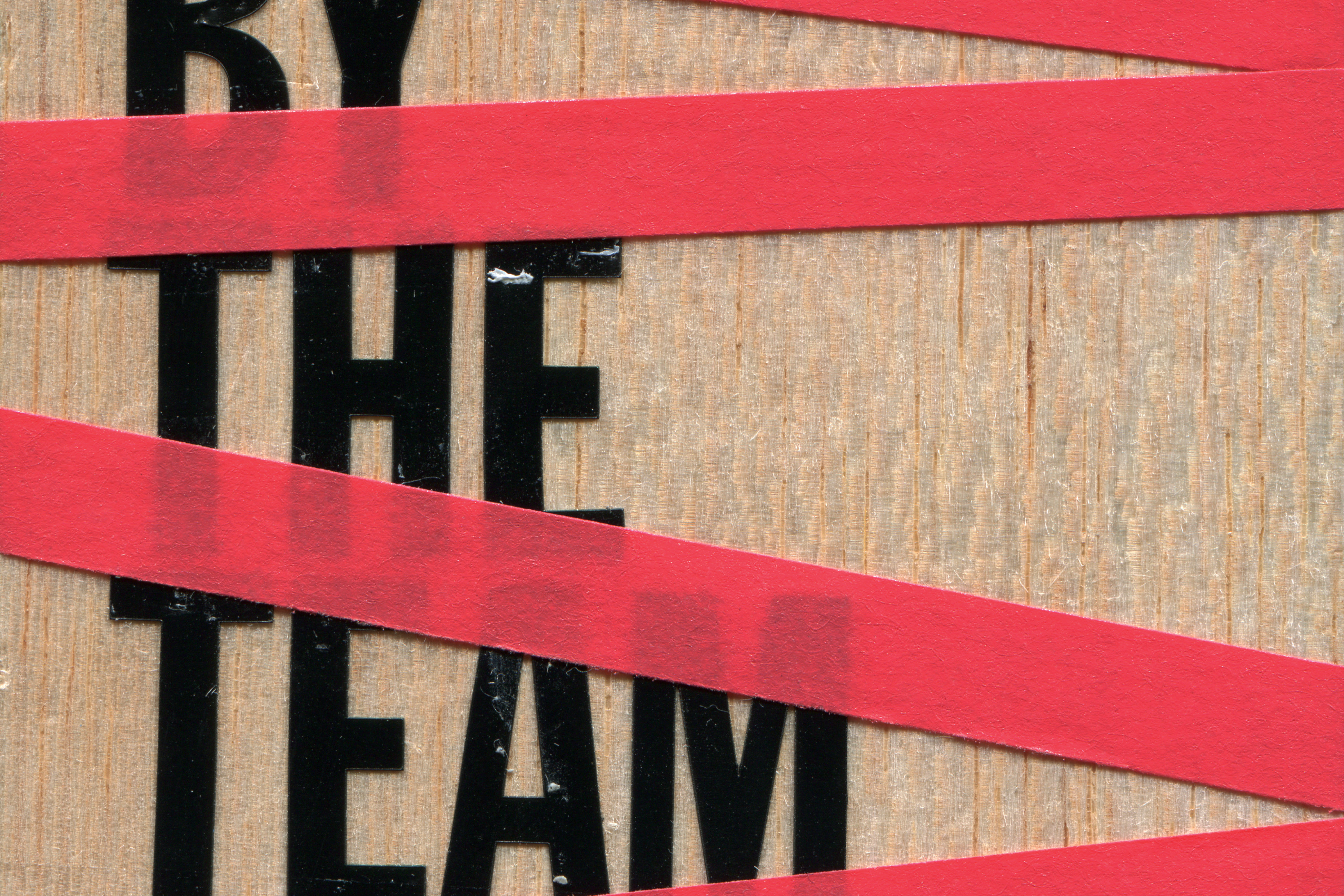
Instead of using an image of wood as a background texture, Wally hand-applied hardware store vinyl letters to a plank of balsa wood. Red electrician’s tape was layered on top of the letters for the masking. The titles of the plays were added digitally to a photograph of the wood, letters, and tape construction.
The cover has a sense of a concept in-process that’s organic, tactile, and imperfect.
The fact that the design was made as a physical object, in the end, seem to be an especially appropriate fit with the spirit of The TEAM.
Below
Original five concepts shared with The TEAM. The plywood concept and red bands titles were developed into the final cover.
Original five concepts shared with The TEAM. The plywood concept and red bands titles were developed into the final cover.
Above
“Five Plays by The TEAM”, Oberon Modern Plays, Oberon Books, 2015
“Five Plays by The TEAM”, Oberon Modern Plays, Oberon Books, 2015
Creative direction, design, fabrication, and photography by Wally for Outside Order.
Wally Krantz’s Outside Order is based in Brooklyn, New York.
OO&Friends
is a strategic design studio making creative thinking real.
© 2021-2025 Outside Order Inc. All trademarks are the property of their respective owners.
Header photography © 2025 Wally Krantz.
Neue Haas Grotesk typeface by Commercial Type.
Website designed on Cargo.
Neue Haas Grotesk typeface by Commercial Type.
Website designed on Cargo.