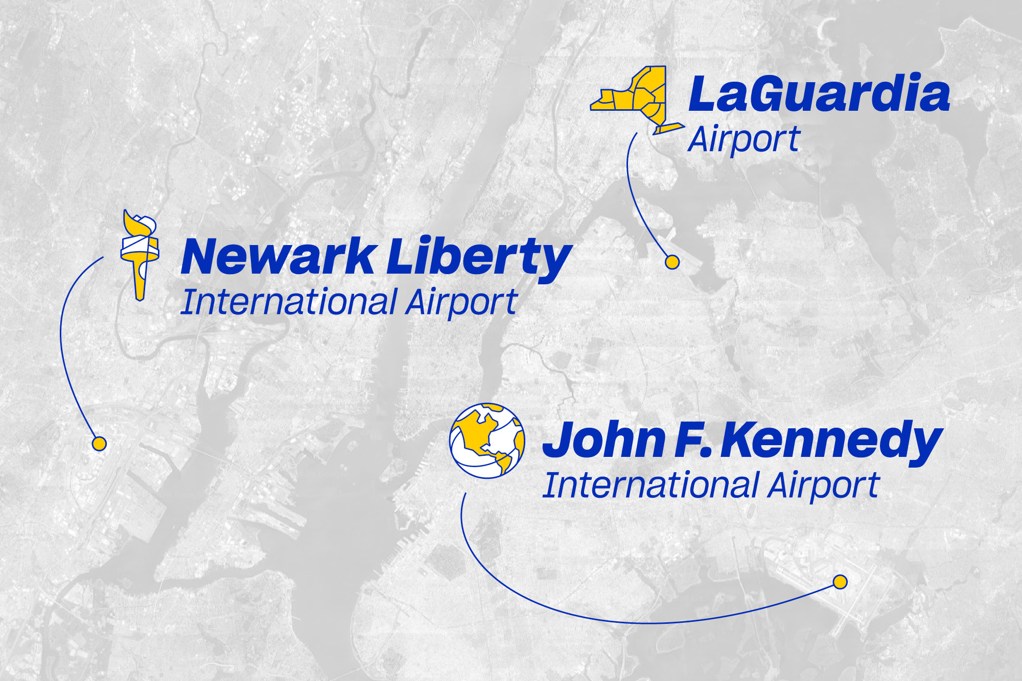
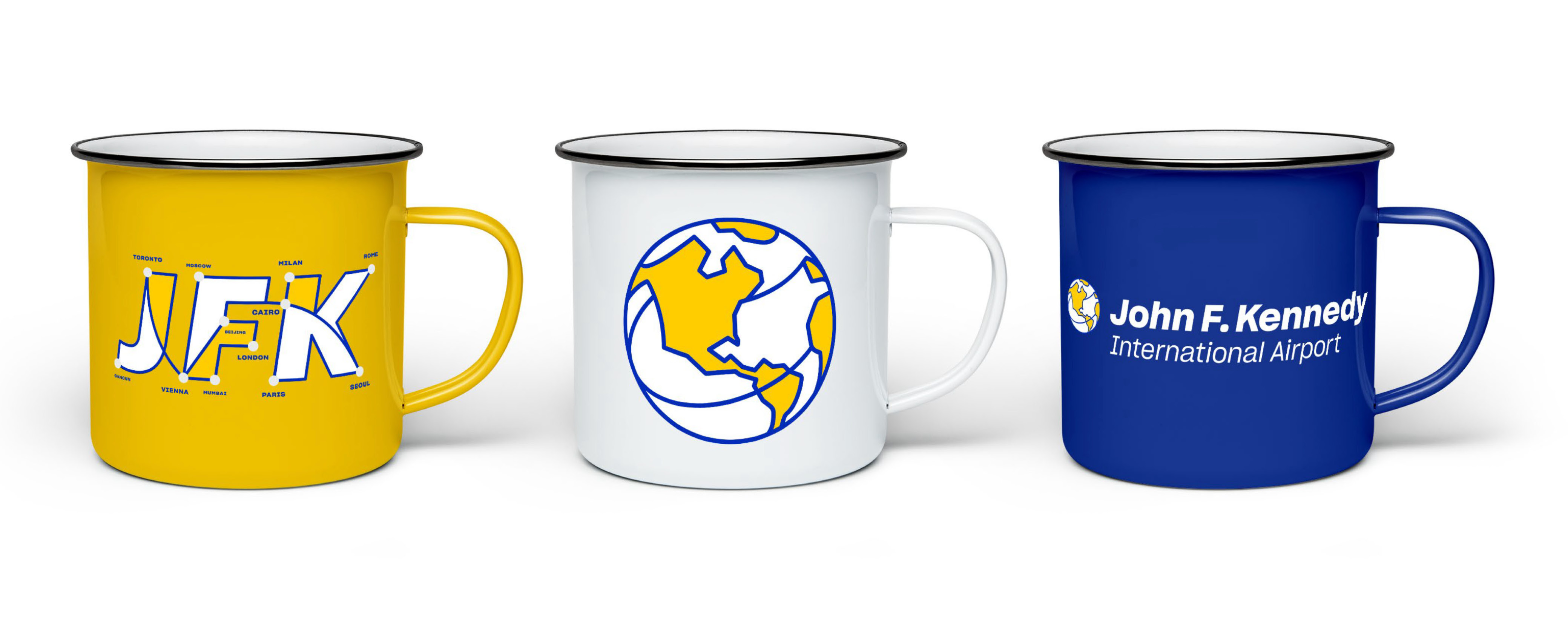
As the Port Authority began a multi-year, $30 billion investment into the evolution of JFK, LaGuardia, and Newark Liberty airports, we partnered with PANYNJ and architects from HOK and Gensler to develop a new visual identity system that could be shared across the three airports. Each airport icon—the globe for JFK, Liberty’s torch for Newark Liberty, and the regions of New York State for LaGuardia—is built on a visual language that expresses pathways and connections. Each symbol was designed to be unique and stand alone while working together as NY & NJ’s three airports.
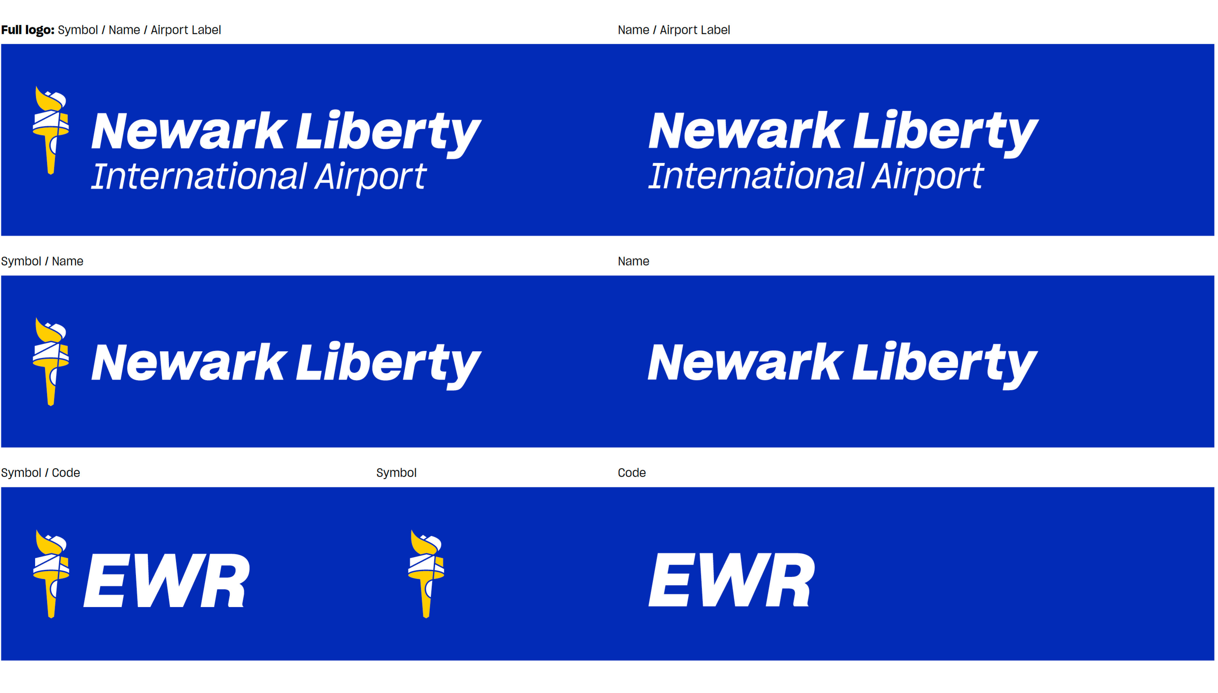
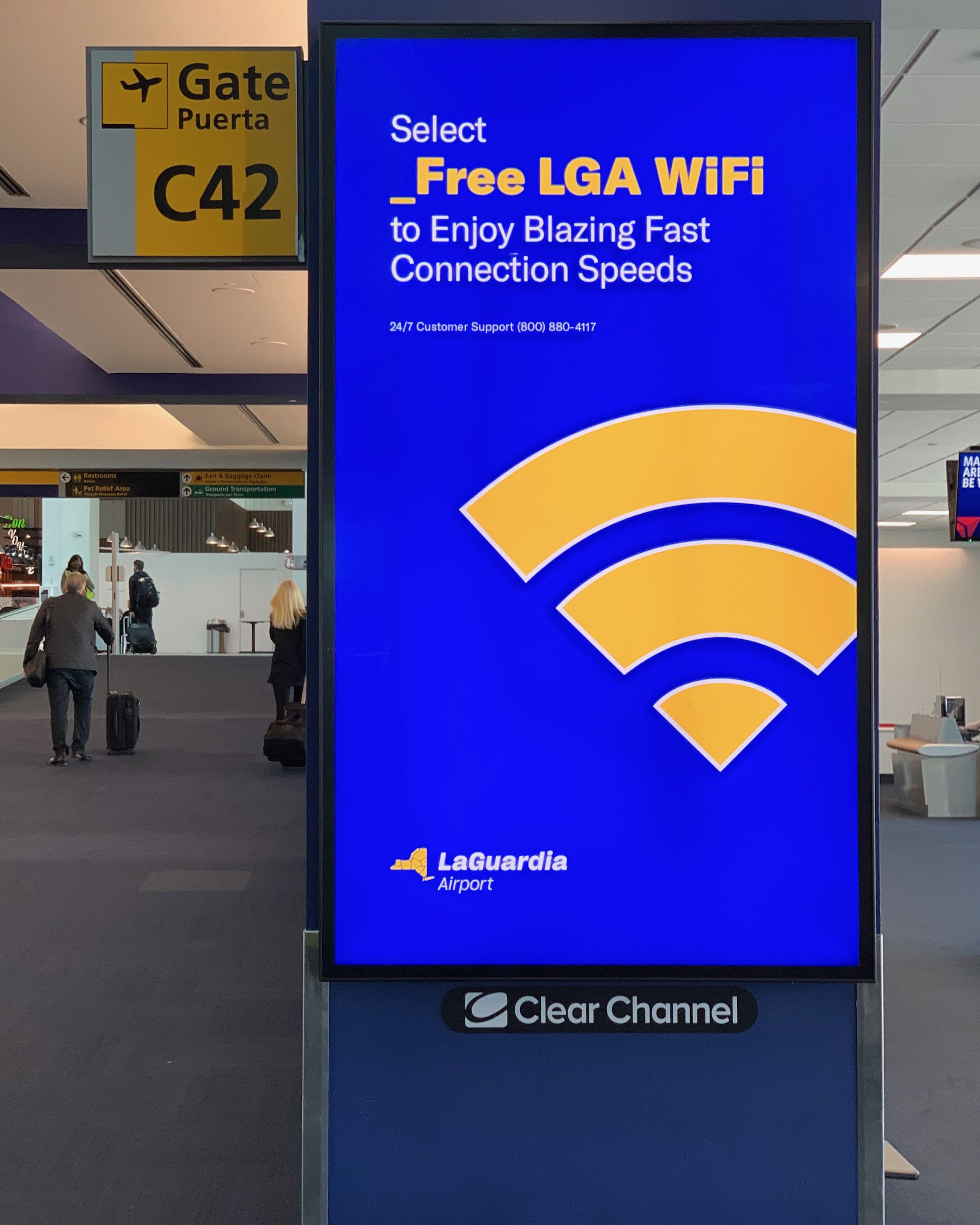
The design style of the three airport symbols became a foundation for a visual language of icons and promotional graphics, three-letter airport codes, wifi symbols, infographics, and special typographic accents throughout the passenger experience.
A shared visual language was created with unique icons for each airport. Typography is set in the expansive Sharp Sans Grotesk family using a consistent application for identifying each airport and supported by a lively and expanded use of the different weights and widths throughout the visual system.


Creative direction and design by Wally with Mariana Hochleitner, João Marcopico, Logan Sheehan, Amanda Voss, and Kris Pelletier at Futurebrand.
Sharp Grotesk typeface by Sharp Type.
Sharp Grotesk typeface by Sharp Type.
Brand identity
Visual identity system
Illustration style
Wayfinding consulting
Executive and Government presentations
Brand guidelines
Visual identity system
Illustration style
Wayfinding consulting
Executive and Government presentations
Brand guidelines
Wally Krantz’s Outside Order is based in Brooklyn, New York.
OO&Friends
is a strategic design studio making creative thinking real.
© 2021-2025 Outside Order Inc. All trademarks are the property of their respective owners.
Header photography © 2025 Wally Krantz.
Neue Haas Grotesk typeface by Commercial Type.
Website designed on Cargo.
Neue Haas Grotesk typeface by Commercial Type.
Website designed on Cargo.